I’m excited to report that I’ll shortly be joining Cancer Research UK for a stint of volunteering with the UX Design team.
The main focus of my work will be on helping the team with their UX pattern library: reviewing it and updating it as well as creating recommendations for its longer term management and coordinating related development efforts with the dev team.
I’m very much looking forward to working with the team and also contributing in some small way to the work of CRUK!
One aspect I mentioned in that previous post about how we might use Lean UX approaches in a traditionally not very user-focused environment was the creation of a UX pattern library. A pattern library is an evolving document that describes interaction design solutions to common design problems. They act as a “first port of call” for a designer or developer creating a new UI and avoid the need to reinvent the wheel or create a new, untested solution.
By using common patterns we not only create consistency within a project, or across multiple projects, but we also reduce the cognitive load on users by using familiar UI conventions and avoiding the need for them to learn new tools.
The pattern library we’ve been working on has grown quite rapidly and is currently only available internally. However, we plan to publish it on a public website once we’ve reached a critical mass of information (both guidelines for UI pattern usage and cross-references to our own implementations stored in an open source Github project). There’s already been some interest from the wider cultural heritage community and having a public resource seems like a perfect opportunity to expand its use from an internal document to become an open source project in its own right.
After spending the majority of my professional life as a full-time in-house “permie” I’m about to branch out a little by moving from full-time to part-time work which is going to give me the chance to explore some other interests and opportunities–I’m not going to say too much about those right now at the risk of tempting fate.
However, one thing I’m hoping to do in the immediate future is to take on some freelance projects and also to look at ways in which I might usefully be able to volunteer my skills to help with charities and non-profits.
In particular I can help with:
Usability testing
Usability audits
HTML/CSS prototypes
Wireframing
Visual user interface design
If there’s anything you think I might be able to help you with, then please drop me a line: info@littled.net or @djlittle on the Twitters.
I don’t generally post on “personal” topics on this site, preferring to keep it to more strictly professional matters. However, I’ve just come out the other side of a recruitment process which I admit I found frustrating on a personal level, but which I also think highlights a more interesting wider issue about job titles and descriptions within the UX field. So, I thought it was worth jotting down some thoughts on it.
I should state up front I don’t want to use this as a forum for simply being critical of an organisation who decided not to hire me; of course that’s their prerogative and it just so happened I wasn’t the right fit for the particular job they wanted to recruit for. Admittedly it might have saved me a little time if they had decided exactly they were looking for (essentially a visual designer) before the recruitment process began, but hey that’s just the way it goes sometimes; and maybe the process itself in this case helped them refine what they were looking for.
However, taking some positives from the experience, it’s made me think more about the term “UX designer”. It can be a notoriously difficult to pin down what this means as “UX” by its very nature is a reasonably vague term. Definitions of the term are fluid and it seems you can’t go more than a day or so without discussion about constitutes a UX designer cropping up (as opposed to a UI designer, service designer or “insert term here” designer).
So, if it’s hard enough for us practitioners to define it must be harder still for employers to articulate what they are looking for in a UX professional. I’ve certainly worked in environments, including my current one which is primarily engineering and research-led—not a criticism, just a fact–where user experience issues may be described as “user interface” or simply “front-end”, or maybe encompass anything developers don’t like doing (including training or documentation). Again, it’s not a criticism of anyone, I think it just demonstrates that non-UXers (quite understandably) may understand UX differently from us. In which case it’s up to us to explain and educate our colleagues, even when their eyes start to glaze.
I personally see UX as an umbrella term, and usually describe it as such in lectures on interaction design I’ve given, using Dan Saffer’s UX venn diagram as an example of it containing a number of sub-disciplines, all ultimately concerned with the way people interact with a digital product (or maybe just “product”).
But I do wonder if the term “UX designer”, both by its vagueness and current trendiness is becoming slightly meaningless. I’ve certainly seem it refer to a whole range of jobs, from more research-oriented roles, ones with a marketing orientation through to more visual design and front-end development roles. In the worst cases I think it’s become a replacement term for “web designer” (maybe with some more references to usability or user-centred design added).
So, what are the core competencies for a UX designer? I’d say they should include the following (but not necessarily be limited to them):
understanding users and user needs (e.g. through research)
interaction design, including user-centred design and usability testing
user interface design (i.e. visual design)
information architecture
Other competencies that could be added might include content strategy, accessibility or in some circumstances coding.
I’ve struggled to define myself professionally–although I will often describe myself as a UX designer, I tend use the term “interaction designer” as I do on this website, resumé and LinkedIn as I feel it aligns to the key competencies in my “t-shaped” skill-set.
Personally I feel if any of the main competencies I list above are being stressed more than any other in a job specification then it’s questionable to describe that job as a “UX designer” job; and there are plenty of jobs that are described as “interaction designer”, “information architect” or “UI designer” (or “visual designer”) as well as the odd remaining “web designer” role. Of course it’s a balancing trick too: if too many skills are being requested or if the UXer is expected to perform miracles, then we’re heading right into unicorn territory.
Or maybe it’s time to do away with the title “UX designer” altogether and just use more exact titles? The problem of course, is that UX designer has become a kind of short-hand for a multitude of roles and skills, some of which might be performed by one individual, particularly in smaller organisations.
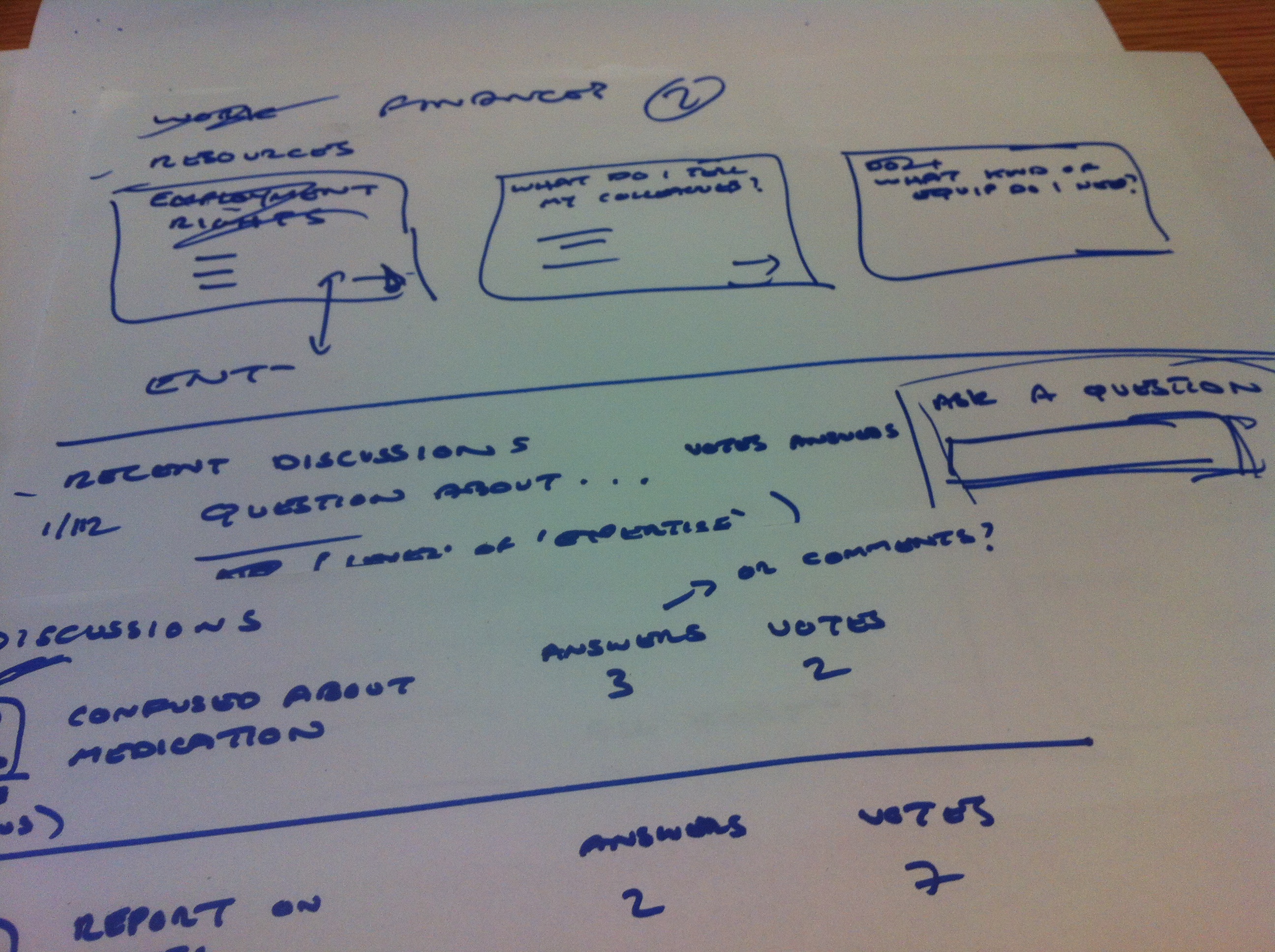
I attended the Lean UX London on “Deciding in the browser” last night in which we worked in teams of three or four on a design brief for the multiple sclerosis support network shift.ms. It was a great opportunity to try a very quick lean approach to getting ideas off paper and into the browser as soon as we could (we had about an hour and half in total so there was no messing around).
The gist of the brief was to design an area for those living with MS to discover resources and have discussions, arranged around themes such as work, family, mobility and lifestyle. Considering the time limitations I think we did ok considering, although our final prototype was missing a lot of the finesse of some of the other teams’ (no pictures and no icons!).
We basically created three screens, only two of which we managed to get into the browser. We concentrated on providing entry points to discussions and resources thematically and looking at ways in which we might reduce the friction for someone wanting to get involved in the conversation themselves. One influence for the discussion area was a Stack Overflow type approach of allowing questions and answers (or comments) to be voted up or down. We started to think about how we might mark discussions as moderated, e.g. by a more experienced member of the community or a health professional, but again only managed to make a start on that.
On top of this we also gave some thought on how we might feature stories of those who’d been living with MS and how these stories might provide inspiration for others. We thought these might work well as “sidebar” content, possibly also voted for by the community.
The team consisted of me, an IA and UI developer. I basically took on the role of sketching, although we took a generally collaborative approach (with the exception of leaving our developer at the helm of the laptop!). We moved quickly from some basic IA work, through sketches to basic html prototypes, created with Bootstrap.
As an exercise it was really interesting, although personally I’m not sure I’d be that in favour of working in this way in my day job. It’s great to see ideas coming together so quickly, but one problem of diving straight into the browser is it could be limiting in terms of the direction you end up taking. Also, I personally prefer to have a little more space for reflection before moving beyond initial ideas into the browser. But, this was an artificial exercise and more about thinking in the browser so maybe I’m being picky!
I’ve been learning more about Lean UX recently and am finding it fits very well with some of the comments I made in my pragmatic user-centred design ramblings back in July.
Whilst I still hold that any methodology should be considered on its merits and not adhered to dogmatically there’s a lot in Lean that makes perfect sense to me, not least in its emphasis on quickly and iteratively testing ideas and assumptions, rather than becoming bogged down in creating deliverables. I’ve wrote about how I’m working to adapt our current UX workflow into more of a Lean process at DDH on our blog.
Without wanting to repeat myself here, the main advantages I see of Lean are:
Using what we know about our users (e.g. user stories or personas) to inform the prioritisation of design work; and breaking this down into small testable chunks.
Working with functional prototypes rather than with static documents such as wireframes (although with caveats).
Collaborative design sessions: by getting designers, developers and subject specialists to sit down and think about problems together instead of isolation we might start to remove some of the friction in the design process.
Building up a comprehensive library of design patterns and design principles to avoid anyone having to re-solve similar problems.
Considering ways in which usability testing can be incorporated more into the project life-cycle–there are logistical and financial challenges to this but these could be considered at the project proposal stage.
On the other hand, I think certain caveats must be borne in mind:
Functional prototypes can take some time to build, even when using tools such as Foundation or jQuery–sometimes time could be better spent by discussing an idea via lower-fidelity means–so there’s still a place for wireframes and sketches.
In an ideal world, testing with end-users might take place regularly (on a monthly or weekly basis). This is currently not practical on most, if not all, of our projects due to us creating products for specialist audiences who will often be time-poor and geographically dispersed.
Due to the fact that some projects have long timescales, care must be taken to ensure the final product’s consistency when working on small, individual parts of functionality across the project life-cycle.
I’m in the process of running some in-depth user research for a NESTA-funded project to create a mobile web app for the Royal Opera House. The brief for the research was to better understand the behaviours and motivations of mobile users when connecting to arts and cultural information online. The outcomes of this research will not only inform the design of the Royal Opera House’s new app but will be synthesised to create a toolkit of best practices for other arts and cultural organisation wanting to develop their own mobile engagement strategies.
I wondered about the best way to collect information on user behaviour and motivations: a number of studies on mobile use already exist, but they are mainly quantitative. I saw an opportunity to gather a data, more qualitative data set. I thought about running interviews or even focus groups, but one idea stuck more than others: using a diary study.
Why a diary study?
To understand how and why people use their mobile devices, you need to be where they are when they’re using them. Except you can’t–due to the very nature of mobile devices it’s hard, not to say intrusive, to naturally observe them being used “in the wild”. A diary study–asking users to keep a record of their mobile use at specific points during the day–seemed to be the natural way to go.
This kind of study isn’t without its problems of course–you’re reliant on your participants providing you with reliable data and it’s hard to verify its validity. It may be recorded some time after the event which causes some potential problems with retrospection. Also, unless you can provide a structured format for your participants to use, the data you’re collecting can be wildly variant and completely unstructured, leading to headaches at analysis time.
Despite these drawbacks, the format was the most appropriate for what I was hoping to achieve. I decided to back it up with more quantitative data in the form of a series of surveys sent out after the study was complete.
Recruitment, structure and drop-outs
Of course, it’s important to be clear about what you’re hoping to achieve before you start a study like this and to have realistic expectations about it. I decided to run my study for ten days: seven days for the unstructured study, followed by three days of follow-up surveys. Any more than this I thought would be pushing participant’s motivation to its limits, not to mention generating a whole load more data for me to analyse.
Recruitment was not a problem for this study: I was lucky enough to get support from the Royal Opera House’s internal machinery for contacting with its audience. This resulted in some enthusiastic sign-ups for the study, drawn from a cross-section of the ROH’s audience. For my part, I used the King’s College internal research volunteer machinery which was less successful. However, when it was announced via Twitter and Facebook, I was literally having to turn volunteers away. Of course, this was a largely self-selecting participant base so that will need to be borne in mind when drawing conclusions from the data.
The participants were incentivised in the form of some Royal Opera House merchandising and access to premium content on the app when it’s launched. However, most seemed to be happy to be simply helping out with the research–whether this is due to association with the ROH itself or other interests is something I’m hoping to discover.
Drop-outs in this kind of study are inevitable, but the drop-out rate seemed smaller than that predicted (10-20%) in some of the literature I read. I was surprised at this, not least as I was asking participants to record their usage at three points during the day: morning, afternoon and evening.
Practicalities
I didn’t have the time or resources to set up any specialist software for the study so I used private Tumblr blogs–one per participant. To set up private blogs you need to create a public one first–the private blogs are secondary. One issue I had is that the only practical way I could find to allow participants to post to their blogs was via a “submit” form URL or emailing to a dedicated email address. As owner of the primary blog, I had to publish entries before participants could see them which created a time lag between submission and appearance on the participant’s site. This caused some confusion and a little frustration for some participants who submitted entries more than once.
Also, Tumblr will set limits on the amount of secondary blogs you can create in one day (ten); quite sensibly–not least to make sure you’re not doing this for nefarious spamming purposes. I’m not sure if there’s a limit to the total amount of blogs you can set up; I certainly didn’t hit it at just under 30.
Using a third-party system has its own advantages and disadvantages. On the plus side you can outsource the running and maintenance of the software, on the downside you can do very little if people experience problems using it. Also, you might have security concerns about hosting this data on a third party system. I was largely happy with it–I wasn’t asking people to record any private data, it was behind a password and the blogs themselves will be deleted once the data has been collected.
On that last matter–data collection, there is no way to download data from Tumblr, unless you want to do things with its API. I actually found the easiest way to get the content out was to copy and paste into a consolidated Word document which I could then use as the basis of my analysis (using a print-out and pens, oh yes).
I should also spare a few words for Google Docs (or Drive, whatever). This was invaluable in allowing me to easily set up a series of surveys and to collect the results in a sensible and usable format. We can take this kind of software for granted, but it’s a great enabler, particularly if you’re in a team of one and have limited resources. So, thanks Google and Tumblr. I believe the appropriate phrase is “you rock”.
Communication
I think one the keys to success in running a study like this is regular communication with the participants. One way to do this is to monitor the entries coming in and see if there are any requests for assistance, or if there is anything you can ask the participant to expand on. However, this is naturally time consuming so I decided instead to send out an email at three intervals throughout the study: beginning, middle and end; and then an email per day during the post-diary survey stage. This was to create a sense of connection between the research team (well, me) and the participant and to try to keep them motivated.
Next steps
Now begins the rather daunting process of data analysis and encoding. But, more on that later.
I recently gave a lecture on user interface design to a group of Master’s students. My brief was quite wide and I had an hour to talk, followed by an hour’s discussion which I used for a small design exercise.
Obviously it’s pretty impossible to meaningfully cover any aspect of user experience in this amount of time so I went for the broadest possible approach: some definitions of the many terms that are bandied about in our profession, a discussion of user-centred design and an overview of key design principles.
The main “take-away” here is that user-centred design needs to be thought of as an embedded process and mindset for any software development and not an optional add-on. I also wanted to stress that it’s not hard to start incorporating UCD–even with limited resources you can start giving a voice to your users.
I attended my first UK Museums on the Web conference last week at the Imperial War Museum and have to say was very impressed with the kinds of digital projects that were being undertaken and the user-centric methodologies underpinning the design and delivery of them.
The presentations covered a wide range of topics relating to digital museums, from planning a realistic digital strategy to refining your metadata but those I found of particular interest related to engaging and involving users in building and using digital resources, a topic I’ve been finding myself more and more interested in of late–addressing those nagging questions about exactly why and for whom we in the digital cultural heritage and humanities sectors are building these resources in the first place.
Museums and galleries arguably have a head start when it comes to involving users in projects: direct access to them as visitors to their institutions. This is something that the Social Interpretation project at the Imperial War Museum (IWM) is making the most of: a project to record visitors’ interpretations of exhibits, bringing them the same ability to share and discuss found on the social web to the museum space, via in-museum devices, the web and mobile apps.
This project is putting the user at the centre of the design process, both directly via testing of prototypes and observation of user behaviour in the galleries. Interestingly, it’s also been run entirely according to an agile methodology–not just the development but the design and management, so I’m really looking forward to hearing more about this.
Another participatory IWM project being developed is Lives of the Great War–a crowdsourced project to create stories of those who served and died in the First World War. This is being done principally by enabling access to the various appropriate information sources distributed across the Web, some of which are behind paywalls, via a single access point. The plan is to archive the resource permanently and also to release the data under a “CCO” licence (the most permissive Creative Commons licence); making the data available for reuse in a number of contexts.
The Outside In project, run by the Pallant House Gallery is a slightly different participatory project–providing a space for artists traditionally unable to engage with the artistic mainstream due to disability or social circumstance to display their work. The interface for doing this was developed iteratively, including in workshops with the artists themselves. The next stage is a mobile app–not for the sake of developing one but because interaction via a mobile device involves fewer cognitive steps, e.g. the need to understand concepts such as file structures when uploading content from your computer’s file storage. With a mobile app, the device which records the art work can also be used to upload it directly.
I was fortunate enough to be elected to the committee of the conference’s organising body, the Museums Computer Group–something I’m very excited about. The levels of innovation and creativity in the sector are very impressive and I’m looking forward to learning and sharing more with all involved.
I recently rediscovered the dissertation for my Master’s degree in library and information studies back in 1999. Having struggled to find anything that really interested me in the rest of that course, my module in “electronic publishing” inspired me to go for the slightly sensationalist title, “A history of the death of the book 1990-2000”. In it I looked at contemporary views on the death of the printed book, examining the utopian views of post-modernist literary theorists on the potentials of hypertext fiction and the opposing dystopian fears that moving from print to digital posed little less than a fundamental threat to Western civilisation.
It’s not a great piece of work–it was written in a bit of a hurry while holding down a temporary job. However it’s interesting to me not only as a personal historical document, but also for its mention of what were becoming known as ‘e-book readers’. References to ClearType and ‘digital paper’ aside it’s clear that these devices were for early adopters only.
Fast-forward another eleven or so years and I’m the proud new owner of an Amazon Kindle, astounded by the quality of the e-ink display. However there’s something about it that reminds me of the Web back in the early to mid ’90s: a technology full of potential but one that is a little limited in its current format. A reminder perhaps that we’re not yet in a brave new age of digital reading but rather starting to explore new modes of publishing and reading.
Long and short form digital reading
In this post I want to concentrate on the current situation of–and possibilities for–digital long-form reading. When I say long-form reading I specifically mean books, or longer texts. Short-form reading (blog posts and magazine articles etc.) is undergoing its own revolution, with tools such as Reeder, Instapaper, Treesaver, Readability and Flipboard helping to transform the way this content is produced and consumed.
Long-form digital reading I believe faces a number of challenges. Leaving aside any copyright etc. issues and concentrating on the experience of reading itself I see these principally as device limitations and uncertain publishing ecosystems.
Specialised ebook readers such as the Kindle allow readers to purchase titles from an online store and transfer them to their device via a network.
These kind of devices tend to use advanced text-rendering technology, such as the Kindle’s e-ink which makes them pretty much as easy to read as a printed book, although they are limited in terms of only being monochromatic and feature limited typographic and formatting choices. As a result they tend to be best for what Craig Mod calls “formless content”, i.e. text that can be consumed divorced from any particular requirements of layout, such as novels or common non-fiction works. They’re not so good at displaying content that depends on layout for its comprehension –e.g. works displaying complex data or with more advanced layout needs.
Smart phones such as the iPhone are similar to e-book readers in that they have limited screen real estate, although they may also be able to make use of the device’s OS to provide more layout options (changing orientations, more fonts, colour displays, embedded multimedia options etc.). Tablets such as the iPad provide increased screen space, although usually with less detailed screen resolutions.
In-app
Amazon offers Kindle as an app–for iOS, Android, Mac and PC. This allows readers to access their library of purchased and free items on a number of devices. Kindle app still provides limited formatting possibilities, and clearly cannot provide such an easy reading experience as the content is now divorced from the e-ink screen.
Other app-based publishers include Enhanced Editions which produces digital texts for iPhone only–in addition to the text of a work they also provide an audio soundtrack of the content read by the author and additional embedded video components.
In-browser
As soon as content moves to the browser it is free of the limitations of proprietary technologies and can be consumed with any device with a browser and network connection. Craig Mod has produced a layout framework for formatting long-form texts, Bibliotype and the Internet Archive’s Open Library is an impressive endeavour to provide access to digitised texts via the browser: readers can view texts online, “borrow” them from the library or where available, buy them from a supplier.
Open Library has a very usable interface and allows the reader to read page by page, skip ahead using a slider, view page thumbnails or search the text. The texts are scanned digital images so it is not possible to highlight, copy or paste content. However, they are of course perfect reproductions of printed works.
Challenges
Digital reading devices all have their own shortcomings. The Kindle and similar devices are bound by screen size and limited formatting possibilities, phones have an even more limited screen sizes and phones, tablets and laptop or desktop computers all use back-lit screens which, even with high resolutions, are tiring to read on for any length of time.
Devices other than dedicated e-book readers also run a multitude of other applications all vying for the user’s attention. It is difficult to concentrate on a text at the same time as being open to incoming phone calls, emails and Tweets.
Like others far wiser than me I’m sceptical about pushing content via native apps when the browser can provide much the same functionality and experience, with the added advantage that it is device-agnostic–as long as your device can run an up-to date browser and has connectivity.
Sellers and publishers might prefer the app environment as it allows them to sell content in a controlled and locked-down ecosystem. But what happens if you move away from a device-specific environment to another. For example you can’t view your ePub files on a Kindle or your Kindle files on iBooks. You can of course convert them if you wish using software such as Calibre, but even then it’s unlikely you’ll get a faithful copy of the original.
The way forward
Take a look at Amazon’s top ten selling books for the Kindle and you’ll see that they’re pretty much crime fiction and thrillers. Making predictions is a mug’s game but I’d be surprised if the mainstreaming of digital texts will herald a desire for the kind of hypertext fiction that late Twentieth century literary theorists got so excited about.
We’re still bound by the notion of the page with e-books. Open Library and iBooks use page turning interaction metaphors and Amazon recently announced it would be including page numbers for Kindle books. This is an indication of both the printed book’s place in culture and society and the fact as a technology it’s pretty much faultless.
So–I can’t see the form or content of digital texts departing radically from their printed counterparts at any time soon. The main reason electronic texts are becoming so popular is that they offer convenience above all else. They are easily purchased, transported and, in the case of more “disposable” texts don’t even clog up much-needed space on your bookshelves. Bad news for charity shops though.
I believe the way forward is to improve the e-book experience–from the ways electronic texts are designed and can be read to the ways they can be purchased or “borrowed”.
Design
Maybe unsurprisingly I do believe the browser is the way forward. Digitised images of texts are fine for older works or works where a copy of the physical presentation of the text is important but HTML makes more sense for new titles. Ever improving typographic possibilities in browsers and the wider adoption of HTML5 mean that in-browser books can provide a richer experience for the reader that could be achieved in-device or in-app.
The creation of new canons for e-book design will ultimately need to reflect what readers read (or what they’d like to read), how and when they read and the kind of devices they read on. Interfaces need to be “quiet” and cut down on clutter so as not to encourage the attention away from the text. The Kindle (device), iBooks, Open Library and Bibliotype are already doing this very well.
The design needs to be responsive to the device being used. Again Bibliotype shows a way that this can be done. Laptops and desktops might need special consideration–after all if I choose to maximise a reading window to reduce visual noise from other applications I still want to be able to read text that’s not huge or running on forever. Having said that, I don’t think laptops or desktops are ever going to be the best tool for long-form reading.
We need better displays too. The best e-book design in the world is still going to be difficult to read for any extended period of time on a back-lit screen. Whether the solution is a wider adoption of e-ink style technology (in colour) or some kind of ability to switch between types of screen display I don’t really know. However it is an issue. The best back-lit screen I currently use is my iPhone’s Retina display. Even with this incredibly detailed resolution and the ability to dim the screen in iBooks, it can’t compare to the Kindle in terms of easiness on the eye.
Distribution
As a reader I want to be able to easily purchase and view books without being locked in to any particular device’s or manufacturer’s platform or store. I want to own my e-books and be able to take my library with me should I change device or if support for older formats is discontinued.
Open Library has made some efforts to replicate “lending” of e-books but I’m not convinced that the one copy to one reader model is practical in the longer term, particularly as Open Library’s membership grows. What about lending on the basis of limiting the time e-books can be viewed or downloaded for, along the lines of the BBC iPlayer model?
Good news for trees?
E-books are not only here and being used, they’re becoming increasingly popular. What will this mean for print books? I’m convinced by Craig Mod’s view that “formless” content is best suited for the current breed of e-book readers and devices, whilst content which has more exacting layout and design needs is best handled by print media, and the iPad and similar devices.
However, we’re still at an early stage with e-books and it’s anyone’s guess what will happen in the coming years. Ultimately E-books need to be not just easy to buy but also to manage, archive, be viewable on any device, but above all, be readable.
Note: just as I was preparing to publish this I noticed a news story on the Guardian website: Kindle readers can now borrow ebooks from libraries (21 April 2011). This looks like promising news, although it currently only relates to the US.