I’ve recently started using moodboards in my design process and I’m finding them a useful way to kick start thoughts on the look and feel of a site. If you’re not that familiar with them then I’d recommend checking out Paul Boag’s article “How moodboards can save time, money and your sanity!“. In his words moodboards are, “a collection of graphical elements that set the tone for your design.”
I’ve found a couple of newish tools particularly useful for creating moodboards: Pinterest and probably more so, Gimmebar. Whilst these don’t do anything essentially different from some other tools I’ve used like Zootool or Evernote I particularly like the way they present your saved artefacts and their minimal interfaces seem–to me anyway–to be well suited to quickly grabbing and dumping stuff.
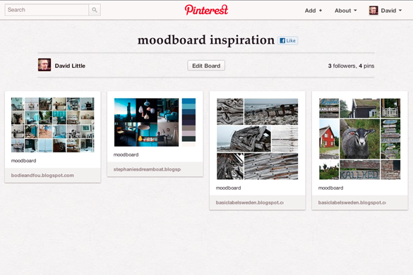
Pinterest
At the moment you need to have an invite to join Pinterest but it’s not too difficult to get one: I requested one via the website and received one the next day. Once you have an account you can invite friends along too. The idea behind Pinterest is you create boards which you can pin things to–either images you’ve found on the Web or you can “repin” from other people’s boards.
I found some interesting examples of other people’s moodboards by searching Pinterest which I was able to pin to one of my own boards.
As the concept of boards underlies the whole app it would seem a natural tool for creating moodboards. However I’ve had some problems with performance: it’s a been a little slow at times which has made it a little frustrating to use. But maybe those are just teething issues.
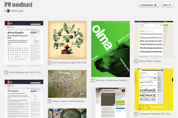
Gimmebar
Gimmebar allows you to create collections, similar to Pinterest’s boards and allows you save various kinds of artefacts: images, videos, full web pages and status updates.
The main advantage of Gimmebar for me is collections can be private or public–so you can create a “private stash” of stuff you’ve found without having to share it by default with the outside world. This gives it more of a notebook feel to me so I don’t feel so self-conscious about creating some kind of finished product. Also, the ability to save a complete web page from header to footer rather than just a predefined or viewport size is a really useful feature.
Like Pinterest, Gimmebar uses that “jQuery Masonry” style of tiling to present results which means it’s easy to browse the stuff you’ve saved and get more of a sense of the overall feel of your collection–making it easier to take editorial decisions on what fits and what doesn’t. I prefer this to say, Zootool’s approach to presenting same-size thumbnails (although as a visual bookmarking tool I think Zootool’s great).
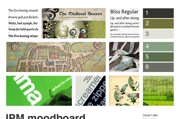
You could share this as your moodboard–either by publishing it or sharing it as a collaborative space with other Gimmebar users, although I like to add a little more editorial control by downloading the images and using them in a Photoshop comp. Here’s one I made earlier:
There you go–pretty straightforward. What do you use?
What was the best thing about this year’s New Adventures in Web Design conference? It’s pretty hard to decide: the speakers entertained and inspired, the organisation was superb and I was reminded just how cool it is to be a designer. But, if I had to pick a highlight? Lack of Wi-fi. Yes, no Wi-fi; unless you really needed it that is. I didn’t take any photos, I didn’t Tweet, I didn’t even turn on my laptop. I concentrated more on the presentations, engaged and learned. Seriously, lack of Wi-fi at conferences should be seen as a feature not a bug.
The lack of network connectivity fitted in quite nicely with themes of two of the presentations. Robbie Manson‘s “The Mindful Designer” encouraged us to step away from our tools, think better and make the most of the teams we work in; think “positive disruptions” rather than the negative ones like the constant interrupting communication flow of Tweets, emails and RSS.
Denise Jacobs delved deeper into this, explaining via a story the different mental states we experience. As someone who’s been interested in the benefits of meditation for the past year or so it was pretty cool to see them being discussed (or at least alluded to) in a mainstream design conference. The brain’s “alpha” states are associated with increased learning, greater creativity and flow. Simply closing your eyes will start the process of entering this state. Playfulness triggers the right side of the brain; gamma states are associated with insights– these can be triggered by laughter. So, according to Denise: to get your creative groove back, breathe, play, laugh. Sounds alright to me.
The conference kicked off with Dan Mall asking us to explain what we do. This set the tone for the rest of the day, getting us to think about exactly what design is: “adding form to a shapeless idea”, mending what’s broken (Naomi Atkinson), making interesting and exciting stuff–after, ahem, loosening the f up (Travis Schmeisser), making things better (Trent Walton), eliciting emotion, inducing action and affecting change (Cameron Koczon) or getting from A to B (Frank Chimero).
If any common themes did emerge I think they could basically be summarised as:
just make stuff–you don’t need a startup and you don’t need to make anything perfect (and let’s face it there’s nothing like a bout of IE7 CSS fixes to kill the excitement of an idea);
give back–as designers we’re in a privileged position to get involved and help out our local communities, education or health service (although they were some murmurings of this veering dangerously towards “Big Society” territory).
teams are good–make the most of the people around you, whether this is your co-workers or the design community.
I love designing with grids and I think the whole responsive design movement is pretty cool (if you haven’t already done so you should check out Ethan Marcotte’s Responsive Web Design for a comprehensive introduction to the area). However, I haven’t been totally clear in my head how the two things relate. Ok, I’ve read about the fluid grid but I’ve found it a bit tricky to pin down what this actually is.
With this in mind I thought it was time to move away from nailed-down desktop-favouring fixed width grid designs and venture into the slightly scarier world of responsive fluid grids. As I always learn better by doing than by just reading I decided to create a example website and go through the whole process from planning to coding, which I’ll share here in case you’re interested (of course you are!).
There’s quite a lot to this whole fluid grid business so I’ve broken up this post in to two sections: first we’ll consider how we might approach a responsive design conceptually and at the visual design stage; in the second part we’ll look at turning the design into HTML/CSS to see it in action.
Some definitions first…
I’m going to be concentrating on fluid grids in these posts rather than responsive design per se. So, what is a fluid grid? Well, let’s think about what we mean by grid first. Wikipedia defines the typographic grid as,
a two-dimensional structure made up of a series of intersecting vertical and horizontal axes used to structure content.
Sounds reasonable to me. In print (or fixed width web design terms) these intersecting axes combine to produce modules or units of a predictable fixed size with which to construct your layout and give it consistency and rhythm. When we go fluid the units–I’m going to use this term rather than “modules” to avoid confusion down the line–will still structure the content consistently and predictably but their size and positioning will change depending on the available size of the rendering device’s display.
We should be clear than fluid grids are not in themselves responsive web design. Responsive design is a combination of a number of elements, fluid grids being one, the others being the use of fluid images / media and the use of media queries to load in CSS depending on screen size.
Designing for responsive, er, design
You could use fluid grids in an old-fasioned fluid design where the grid units resize according to screen size, but in a true responsive layout it’s likely your grid will reflow when the screen size changes. For instance, a 16 unit wide grid may be fine on a desktop or laptop browser but an 8 unit wide grid may be more suited to a tablet (or a desktop browser at a smaller size) and a 4 unit grid to a mobile screen. Of course it’s not just a case of halving the amount of grid units on a screen and moving the remaining content on to the next line: it takes more thinking than this to ensure your desired content hierarchy is reflected at different resolutions. One of the reasons that true responsive design is pretty demanding; but that’s good, right?
Introducing our sample site
The site I’m going to be using is a real site for a project I’m currently working on for a basic HTML/CSS framework simple enough for designers to do rapid prototyping with but powerful enough to use for proper site builds. SPIL (simple powerful interface library) is written in HTML5 and uses OOCSS concepts to make code easy to get to grips with and maintain. But, more of that later. SPIL is due to be released under an open source (BSD) licence and will have its own website containing information about the project, a download link, documentation and a gallery of projects built with SPIL. Nothing too complex.
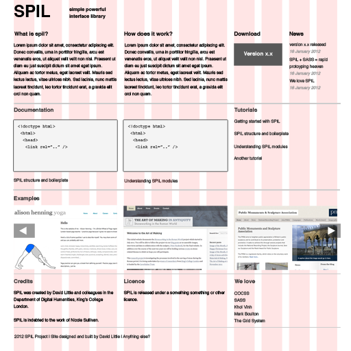
This is our Photoshop comp showing what the user will see on a desktop-size screen: a 16 unit grid taking up 960 pixels of screen width.
Before we launch off into fluid grid land we need to make some decisions about the kind of devices and screen resolutions we’re going to support and our audience. Well, luckily we can bypass a lot of the user research you might normally do at this stage as we know the users most interested in this are going to be designers and front-end developers. So we want to ensure we cater for our highly tech-savvy audience and make sure our site looks good on desktop, tablet and mobile.
Let’s consider the contexts in which people might be looking at our site. Again we’re going to make some assumptions here based on our own knowledge and experience. If you want to download a framework and play around with it, chances are you’re going to be on a desktop or laptop. However as we know that the web world will be all-abuzz about SPIL (yes, I know, just pretend ok?) let’s imagine (try hard now) that people will be sharing it with others at conferences and meetups. So our design should reflow to display clearly and usefully at the kind of resolutions we’d find on tablets and mobiles.
We’ll call our target layout sizes “desktop”, “tablet” and “mobile” but of course this is a little misleading as a desktop browser is capable of displaying all of them depending on its viewport size; likewise a tablet browser could also be resized to show the lower size.
Content hierarchy
Before we can make any design decisions we should think about our content hierarchy and what will be important to different users.
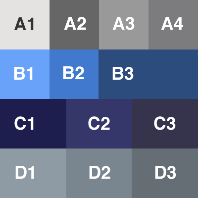
Let’s look at our comp again. We’ve got four rows with 3-4 groupings of information on our main “desktop” layout. Let’s categorise them below (leaving aside the header and footer).
Row “A” (About):
1. What is SPIL?
2. How does SPIL work?
3. Download button
4. News
Row “B” (Documentation):
1. Code example one
2. Code example two
3. Full list of tutorials
Row “C” (Examples carousel)
1. Screenshot one
2. Screenshot two
3. Screenshot three
Row “D”
1. Credits
2. Licence
3. We love (links to other sites)
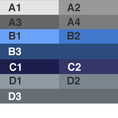
“Tablet” resolution
As we’ve got less screen real estate on a tablet we need to think about structuring our content accordingly: we still want the most important information most prominent. We’re going to use a 8 unit wide grid for our tablet design, half the amount we’re using for the desktop.
Arguably the download button is not so useful for tablet users as they won’t be working with the framework in that environment. However, remember that this resolution is also available for desktop users and we don’t want to assume that tablet users definitely won’t want to download the files. So we’ll want the first row to display our initial row “A” information about SPIL but will move the “download” and “news” section to the row below thus:
A1 A2
A3 A4
We’ll handle the “documentation” section in a similar way:
B1 B2
B3
Our initial row “C” is a carousel of three images. We’ll make this smaller for our tablet design, just showing two of the images at any one time:
C1 C2
Our initial row “D” can be reflowed thus:
D1 D2
D3
Our mobile design
We need to think more carefully about our mobile design: we’ve obviously got even less space than for the tablet design so we want to be cautious about what we show.
We’ll be working with a 4 unit-wide grid for our mobile design. We’ll reflow our initial row “A” information accordingly:
A1
A2
A3
A4
For our initial row “B” information we’ll do some editing. We don’t want our page to appear too cluttered on a small screen so let’s dispense with the “teaser” code examples and just list out our tutorials:
B3
In terms of example websites we could decide to edit these out entirely or just display one image:
C1
For our initial row “D” information we’ll just stack these on top of each other but for the sake of a more concise page we’ll leave off the links to other sites.
D1
D2
So, would you bother creating Photoshop visuals for these design as it’s tripling the amount of work you need to do? I guess it would depend on the size and scope of your project and the client you were working for. But in our case we’ll just use our sketches to inform how our layout and content will reflow at lower screen sizes but will do all the work in-browser.
So, so far we’ve thought about what a fluid grid is and how it relates to the area of responsive design. We’ve also thought about our site’s content hierarchy and how we would want to present this at different screen sizes. With all this considered and documented it’s time to move on to the only place we can see responsiveness in action: the browser. But that’s for next time!
Over the last few months I’ve been increasingly impressed by the Object Oriented CSS (OOCSS) approach to coding CSS, adopting the methodology as far as I understood it for one freelance project I worked for and in the redesign of my own website. (more…)
Well, I’ve finally got there. This website has just received a much-needed overhaul and polish.
As well as refreshing the design I’ve rewritten most of the content which was in desperate need of updating. I’ve also take the opportunity to have a spring clean which means a lot of the old blog content has now been cleared out. With the exception of a few more popular posts (and let’s face it there weren’t too many of them) which I’ve decided to keep, I really wanted to start with a clean slate.
The entries on this blog probably won’t be too frequent as I want them to be considered and more essay-like. I’m going to continue to maintain my Posterous blog for the more notebook-like stuff but writing over here is going to be more focused on my key professional interests.
Please bear with me while I iron out the bugs–I know there’s some IE7 glitches I haven’t caught yet, particularly relating to spacing/padding on lists. However, I realised if I waited until I’d got everything 100% then this site would never have gone live–and Internet Explorer 7 accounts for virtually no site visits (and IE6 even fewer so I’m not even going to bother trying to support that).
The old site will remain for a time (slightly confusingly) at www.littled.net/new so the old links will still work for a bit but as soon as I’m sure everything’s working I’ll start redirecting to the new site.
Update 11/3/2011: my old site is no more so the old URLs will redirect to the new site. Some content may be missing so let me know if there was anything in particular you were trying to get hold of.
JQuery gives you a very simple way to create dialog overlays with the dialog() event. So, by clicking an HTML element you can activate a “stay-on-the-page” overlay dialog box.
Traditionally one might use dialog boxes to ask the user a question to which she must respond (e.g. with an “Ok” or “Cancel”) but their use can extend beyond this. For instance I’ve used a dialog to show a mega drop-down menu; i.e. clicking a link opens a dialog box with a list of categorised links.
JQuery’s default behaviour for closing dialog boxes is not unreasonable: the user must click on the “Close” button (e.g. in the form of text or an “x”) or hit the escape key. However it’s possible you may want to provide more options for your users to close a box by simply clicking outside it.
I puzzled over this and didn’t get very far with Googling but came up with the following solution which seems to work.
When your dialog is created, a div with the class “ui-widget-overlay” is also created which “greys out” the background allowing the user to fully focus on the dialog. You can use this as a hook to add your dialog closing code, e.g.
In this case my dialog has the ID “quick-links-modal”. NB you need to use the “live” event (rather than “click” etc.) in order to bind the event to your dialog before the dialog has been initiated.
Another pyrrhic victory maybe, but something that has made me exceptionally happy this afternoon. Basically, yesterday I upgraded my version of Flash Player to version 10 only to find that the Flash files on our Plone-powered site no longer worked.
The lovely folks at SWFObject helped to identify why this was happening — nothing to do with SWFObject at all but the fact that Flash Player 10 implements some new security “features”. I managed to isolate it to the fact that Plone serves up ATFiles with the header, “Content-Disposition: attachment”. Flash Player 10 ignores files served up with this header, so you need to override this and set it to “Content-Disposition: inline;”.
I came up with this solution which may not be overly elegant but at least it works. I created a skin-level Python script that sets response headers before returning the file:
Jason Beaird, The Principles of Beautiful Web Design (Sitepoint, 2007)
Aimed primarily at Web developers and programmers who want to expand their knowledge of design and the design process, Jason Beaird’s Principles of Beautiful Web Design is a great entry point for those wanting to know what it is exactly designers do and why one’s own websites often look, well, a bit pedestrian.
Over five chapters Beaird explains the basics of design theory as well as what he sees to be the key principles of beautiful Web design. Much of the first three chapters concerning layout and composition, colour and texture is reasonably generic and is informative about the design process as a whole. Only the last two chapters are technical in the sense of talking specifically about CSS and Photoshop, so even non-techies shouldn’t be too put off.
As someone who’s worked with the Web for a number of years I was a little concerned that at best this book would underline what I already knew or at worst encourage people into bad habits, elevating aesthetics over standards, usability and accessibility. Neither was the case I’m glad to say; actually it showed me how little I actually knew about Web design and coming from the Sitepoint stable I should have known there would be a clear commitment to promoting web standards and stressing the centrality of content. Design is placed in context as one of the factors which make a successful website.
I found the definition and explanation of design terms and concepts particularly enlightening; Beaird gives an overview of concepts such as the rule of thirds and the “divine proportion” which produce aesthetically pleasing results when applied to artistic composition. Chapter two’s dip into colour theory was also very interesting. In addition to learning about colour wheels and additive and subtractive colour models, I now know the difference between a shade and a tint. Working out which colours go well together can sometimes appear intuitive but it’s a great advantage to know why they work and what other colours you can also use to build up your palette.
Beaird discusses current trends as well as general principles For instance, I’m glad he makes the case for right hand navigation; I’ve always found it slightly more intuitive. The thorny issue of fixed versus liquid layouts is also discussed. Views on this seem to change with the weather, although fixed widths seem to be the odds on favourites at the moment; not least I suspect because they are still easier to build in CSS in addition to giving the designer more control. The “variable fixed width” layout might be an emerging compromise: a design which has its layout determined by the user’s browser size.
Of course, no contemporary book on Web design could escape discussing rounded corners.There are pointers to various methods on the Web, ranging from the horrific (in terms of semantic HTML) to the more acceptable.Typography on the Web is still very limited; nonetheless we get an entire chapter dedicated to it. In addition to covering the commonly available font families and contemporary techniques such as sIFR, we also get an in depth description of the anatomy of a font. This is clearly one of the author’s favourite areas. I imagine that coders will already be familiar with the less esoteric sections of this chapter as they will with parts of the last chapter, “Imagery”. Imagery? Is this really what he means? Surely, “images” would have been a more suitable title.
Pedantry aside, this chapter will probably be of most use to the uninitiated in its discussion of where to obtain images. I now have a list of stock photography sites to investigate for my next design project (which looks it will be my own site now I know what I’ve done wrong). We’re also told what not to do; i.e. don’t steal others’ work, or worse link to files on their site (“Google ganking”). Beaird also gives us a short Photoshop tutorial on creating borders and edges and discusses CSS effects that can be applied.I’d be hard pushed to find any real criticisms of this book. One thing that made me baulk slightly was the suggestion that you use the blockquote element to create emphasis on a page (p.22) when really the only justified use of this is to mark up quotations. Secondly I would have found some information on how designers create graphics interesting; but this is probably beyond the scope of the book.
At under 165 pages, this book can only serve as an introduction to Web design. It also won’t make you a designer, although it will at least give you some ideas of what works and why it works, and what doesn’t. It’s an inspiring book however, and it left me really wanting to try out some of the ideas. It’s also very encouraging in that it doesn’t just tell you to watch and learn from the professionals but to use your own personality and background.
Specialisation is something that has been taking hold of the Web in the last few years with a clear attempt to draw lines between programmers, front-end coders and designers. As anyone who works in the area will know, in reality it is hard to enforce these divisions; designers need to know their HTML and CSS (as does clearly the author of this book); front-end coders can make good layout designers and can benefit from understanding back-end code and how web servers work; back-end programmers need to know their front-end code and understand design, especially if they are to avoid the horrors of what I refer to as “programmer’s HTML”, that nasty mess of unseemly and unsemantic code that they so often produce if left unsupervised, not to mention some of the crimes against design decency they can be responsible for. In this respect, any book that helps to inform the blurs round the edges should be welcomed.
Following on from the Google Developer Day a few weeks back, in which we were all encouraged to encode our geographical data in KML format (Google can index data encoded in KML), I thought I’d have a play around with KML overlays in Google Maps. KML is used mainly to mark up overlays in Google Earth, but a subset of it is available for use in Google Maps.
The title of this post is a little misleading — show me anything you can do in Google Maps in two minutes and I’ll buy you a bun. By the time you’ve worked out the longitude and latitude references for your map and its placemarks you’ve probably lost a couple of hours at least but we’ll brush over that for now.
However, using KML overlays for maps can save you a bit of time fiddling around with the API when creating your markers and setting the event listeners and the like. Encode your data in a KML file, point your maps script at it and much of the work is done. It’s not quite as flexible as using the API, but for a basic map it will save you some time. What’s more, you can use your KML file on the Google Maps site, export it for use in Google Earth and get your data indexed on Google.
I’ve created a basic example which plots three points of interest in Greenwich, London. The references may not be very accurate but I don’t care, it’s a demonstration. First create your KML file. This is a XML file with a .kml extension: <kml xmlns="http://earth.google.com/kml/2.1">
<Document>
<name>A small map of Greenwich</name>
<description>A very basic map of Greenwich,
SE10 made to demonstrate KML
overlays</description>
<placemark>
<name>The National Maritime
Museum</name>
Then create your Javascript file. Create an instance of GGeoXML and give it the location of your KML file. Then use the overlay method of GMap2 to overlay it on your map. Be warned that your KML files will be cached by Google Maps which can be a tad frustrating when you’re trying to debug your file. To avoid caching, add a query string parameter to your file name with a value of the date and time (this will change every second which should be enough for you).
E.g.
url_end = "?nocache=" + (new Date()).valueOf();

myKML = "http://www.myserver.com/kml.file" + url_end

var map = new GMap2(document.getElementById("map"));

// Add controls
If you want to play with the code yourself, don’t forget you’ll need to substitute my maps API key for yours.
A couple of things to look out for
Make sure you keep the CDATA sections in the placemark description tag, otherwise you’ll need to escape your html with entities.
Don’t bother putting class names into the HTML in your KML file’s description tags as these will be stripped by Google Maps. Google Maps uses inline styles instead. Ouch. To get round this problem you can build some styles in your map page stylesheet. As a default Firefox will display the text of the name element of your placemark in bold, although Internet Explorer 7 won’t. I got round this problem thus:
#map div { font-weight:bold;}
#map #iwsw p { font-weight:normal !important;}
The iwsw id is what appears to be generated around your placemark window, so you can use this to cascade your styles down.
If you make a syntax error in your KML file, you won’t get any warnings — it just won’t display. It may be best to edit your file as .xml file in your editor of choice and then save it out as .kml.